I cannot remember his name. In an old photo I have misplaced, an additional offense, he stands behind all the other Art Department professors, hunched over, his head barely breaking the line of their shoulders, face partially turned, his hair parted in the middle. I thought he looked like an older T.S. Elliot. During my stumbles through the wasteland that was my first semester of college, his class in introductory art history may have rescued me. Three times a week we all sat in the darkness of his classroom entranced by his slides of great paintings and sculptures and buildings, and by his sharp, dazzling commentary on their beauty. He was one of a dozen in my life who taught me how to see clearly and thus how to love something deeply.
 Patti and I visited museums throughout France and slowly moved past hundreds of paintings, maybe a thousand, maybe more. Most vanished from my memory as soon as my eyes refocused to the next. The five I’ve chosen to describe are not famous or even the best of what I saw, but they anchored themselves in a response and as such they are a part of my trip, a part of la glorie de la France as it makes sense to me in recollection. That tall old man who wore his trousers hitched up to his navel floats next to me when I think about what I have tried to see in them, a ghost from the back country of Pennsylvania whom I owe for teaching me how to love paintings.
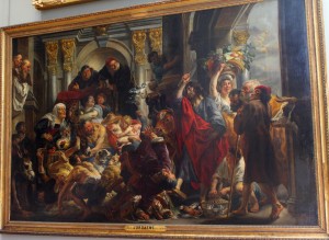
Jesus Chassant Les Vendeurs du Temple (1645?) by Jakob Jordains
Jordains captures the guilty enjoyment we feel when we can safely watch a brawl erupt. I love the raucous, stuffed-full landscape of all those heaving faces. Look at the chaos of tumbling ass-over-teacups bodies provoked by a not terribly energetic whip wielding Christ; his force consequent seems out of touch with his force exerted. That touch is comedic and at ironic odds with the subject of the painting, Christ driving the merchants out of the sacred confines of the temple. Jordains subverts the seriousness of his subject matter as he describes its moment of eruption (you must click on the painting and then click again to enlarge it).
He has an eye for the incongruous but truthful detail. Every kind of human being comes to the market place. Right behind Christ a woman carries a tower of fruit in a basket; one eye appears sealed shut and her mouth hangs open as if caught mid-shout advertising her wares. Follow the line of her basket down to the three onlookers, especially the weirdly crooked, sharp faced man in the red hat and behind him, the great head of the bull, its face as stern as a judge. Look at how the red of the man’s hat leads your eye to the red slash of Christ’s robe and then over to the off-shades and subtler reds of the mother’s and old woman’s robe and sash, the red comb of the rooster and the red drape over the scribe’s desk. That red, the gold scroll work on the columns along the top and the tumult in the left center of the picture hold it together and give all of the wild energy of the scene a unity of feeling and effect. This painting both moves and remains coherent.
I love all the faces, animal and human. I count 27 all told, including donkeys, sheep, cattle and a dog. Look at the grotesque babies and wonderfully debauched expressions of the vendors and of the drunk, both arms encircling his amphora of wine. The pleasure I find here lies in its comedy, in its refusal to be pious, in its acceptance of the chaotic, shifting emotions of crowds of individuals in the midst of conflict.
I don’t know if this is a great painting, but I think it works because it links to the life I can see outside the confines of its frame. “The notion that art and life are somehow separate has worn out. Dewey argued … that art focusses and intensifies life in the present, invigorating memories of the past and whetting appetites for the future.” * Dewey liberated painting from the narrow aridity of art for art’s sake. Paintings are of the world. Why try to tame them? Why try to force them into theoretical boxes? Good paintings are provocations.
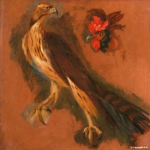 Etude d’un Autour des Palombes et d’une tête de Coq (1668?) by Pieter Boel
Look at the wonderful eyes of the goshawk and the rooster, so alive and individual. Boel painted animals without sentiment, outside of allegory, as the focus of his work and not as appendages to human actions. His use of a red and brown ochre as the dominant color of his palate gives his animals their vivid individuality and helps him avoid that cloying sentimentality that ruins so many contemporary pictures of dogs and bears, wolves and horses.
He painted them as worthy of our interest as creatures, not as economic objects. In the mid-17th century animals were seen as clockwork mechanisms devoid of emotions and soul. They were the property of any person who could so enforce his claim and therefore subject to all the abuses that property might have been subject to – neglect, exploitation, destruction, cruelty. Boel seems distinctly modern in granting individual animals a space empty of human beings. They have the whole world of the canvas to themselves and thus can demand all of our attention. Images for Pieter Boel’s Work
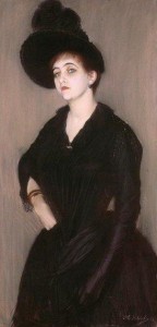 Portrait de Marie Blanche Vasnier (1888) by Jacques Emile Blanche
After you examined that strong face and the way her tilted head and unafraid gaze join to suggest a questioning intelligence, a skeptical attitude, were your eyes too drawn to the right hand, cocked on her hip in a fist?
Her black dress shines like armor, even down to the left hand, enclosed in silk as if it were mail. Her black eyebrows are unusually long, their curve, sharp and aggressive. Modernity is all about the stripping away of surfaces and accretions, habits of control and traditions of behavior, old patterns of seeing. Vasnier portrays his wife as a woman of contemporary life, an individual, a sexual being, a person not subsumed in her husband. Everything in the painting serves to isolate her face and further focus our attention on her eyes. There is nothing submissive in her gaze, nothing tremulous. She holds our looks and returns them defiantly.
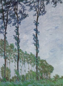 Effet de Vent Serie des Peupliers (1891) by Claude Monet
In a letter written in 1807 John Constable, the English landscape painter, wrote, “Painting is but another word for feeling.” He does not mention anything about representations of reality. His emphasis is on the artist’s emotional engagement with his subject and by extension the viewer’s emotional response to the finished work. Monet is direct, almost scientific in his title: Effect of Wind Series of the Poplars. His effect is to make the viewer first imagine wind and sky, air and light, and then upon stepping outside the exhibition hall into the elements, to let one reality complement the other – complement, not compare. I think he understood that our perceptions are promiscuous. We mix and match our imaginative visions with our waking visions. We combine and cut and paste. We leap from the images of bending trees inside our heads to the trees bending in front of us. The exhilaration of one adds to the exhilaration we feel in the presence of the other. Both visions affirm the importance of the fully lived-in-moment, and of the way that light alone can be transformative.
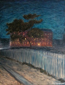 Logement Proletaire (1898) by Eugene Jansson
Do you see how Jansson makes us into voyeurs? Our position places us in the road, outside the fence, looking at the lodging of workers (not the home of aristocrats and not a cathedral, but a humble boarding house). The broad, coarse brush strokes of the sky suggest something unsettled. The tree that must partially cloak our presence appears in motion. We cannot tell whether it is dusk or early morning, but the lodging is astir, every window lit in warm and sometimes sharp yellows. The wonderful whites of the roadway and fence add to the luminous emotional force of the painting. This scene could have been foreboding, but instead Jansson makes it inviting — an attraction, not a repulsion.
Think about standing outside any dwelling, hidden by darkness, looking within – don’t you imagine the lives of others as lived inside? Don’t you flip yourself inside and into another life? The framing of this painting reminded me of Nick Carraway from The Great Gatsby; a little drunk, he imagines walking in New York City: “Yet high over the city our line of yellow windows must have contributed their share of human secrecy to the casual watcher in the darkening streets, and I was him too, looking up and wondering. I was within and without, simultaneously enchanted and repelled by the inexhaustible variety of life (35).”
France would not have been complete for us without the paintings we saw there. Within museums and without, the forms of one variety of our time there contributed a sense of harmony to the rest.
* “Moving Pictures: The Barnes Foundation’s New Home” by Peter Schjeldahl. The New Yorker, May 28, 2012.